
Helpdesk Dashboard: Key Metrics You Should Track

A helpdesk dashboard gives IT leaders a live view of ticket demand, service speed, SLA risk, workload, and user satisfaction.
Tracking the right metrics matters because a busy queue can look healthy until aging requests, repeat issues, or missed targets reveal the real problem.
- A useful helpdesk dashboard combines demand, speed, quality, workload, and customer experience instead of celebrating one isolated KPI.
- Track volume, backlog, aging, first response, resolution time, SLA compliance, first contact resolution, reopen rate, workload, and CSAT.
- Compare trends by priority, category, department, channel, and technician because overall averages can hide the queue causing trouble.
- Use live views for daily action and historical reports for staffing, root-cause analysis, budgeting, and service improvement.
- Choose a helpdesk ticket dashboard that is customizable, role based, drillable, and connected to your existing support workflow.
What Is a Helpdesk Dashboard?
A helpdesk dashboard is a visual workspace that turns ticket data into operational signals. It shows open requests, incoming volume, response and resolution times, SLA status, technician workload, trends, and satisfaction. Managers use it to spot risk quickly, while agents use focused views to prioritize work that needs action first.
A helpdesk ticket dashboard is more specific. It centers on the queue: what arrived, what is assigned, what is waiting, what is overdue, and what is close to breaching a service target.
That distinction matters. A Head of IT may need monthly service health. A technician needs assigned tickets, urgency, age, requester replies, and due times.
Recent dashboard guidance makes the same practical point: one view should not serve everyone. Useful dashboards surface core operational metrics, then let users break tickets down by status, priority, category, and agent.
Why Does a Helpdesk Dashboard Matter?
The hardest service desk problems often build quietly.
Imagine Monday morning shows 240 open tickets. If 190 arrived that morning and most are low priority, the queue may be manageable. If 70 have been open for days and 14 critical incidents are near SLA breach, the same total means something different.
A dashboard adds the missing context.
It Shows Whether Demand Is Outrunning Capacity
Compare tickets created with tickets resolved over the same period. If incoming work exceeds completed work for several weeks, backlog grows even while technicians remain busy.
It Exposes Risk Before Users Escalate
A month-end SLA report explains what failed. A live SLA view shows what could fail next.
Showing tickets approaching response or resolution deadlines lets supervisors reassign work before a breach. Modern service dashboards commonly surface met and breached SLAs plus active requests already at risk.
It Prevents One Metric From Telling the Wrong Story
A team can lower first response time with quick acknowledgments while resolution time rises. It can close more tickets while reopen rates increase. It can improve an average while old cases remain untouched.
A 2025 IT service benchmark analyzed more than 187 million tickets from 10,743 organizations in 118 countries and reported an overall first-contact resolution rate of 74.14%. Its scale reinforces the need to compare service performance across several KPIs rather than one headline number.
What Should a Helpdesk Dashboard Track?
A strong helpdesk dashboard tracks enough data to explain demand, speed, quality, and capacity without becoming a wall of charts.
1. Tickets Created and Resolved
Track how many requests enter the helpdesk and how many the team completes. Compare both over the same period. If 500 tickets arrive and 470 are resolved, the difference becomes additional backlog.
Break volume down by department, category, service, location, and channel. A sudden spike may signal a failed rollout, access problem, network issue, or onboarding wave.
Do not judge technicians by closure count alone. Someone handling complex infrastructure incidents will naturally close fewer tickets than someone processing routine requests.
2. Open Ticket Backlog
Backlog is the number of unresolved requests still waiting for completion. Segment it by priority and age. Eighty recent, low-impact tickets may be manageable. Ten critical tickets waiting for hours may require immediate action.
Watch direction as well as total. A backlog that rises across several reporting periods can signal capacity, routing, process, or recurring-problem issues.
3. Ticket Aging
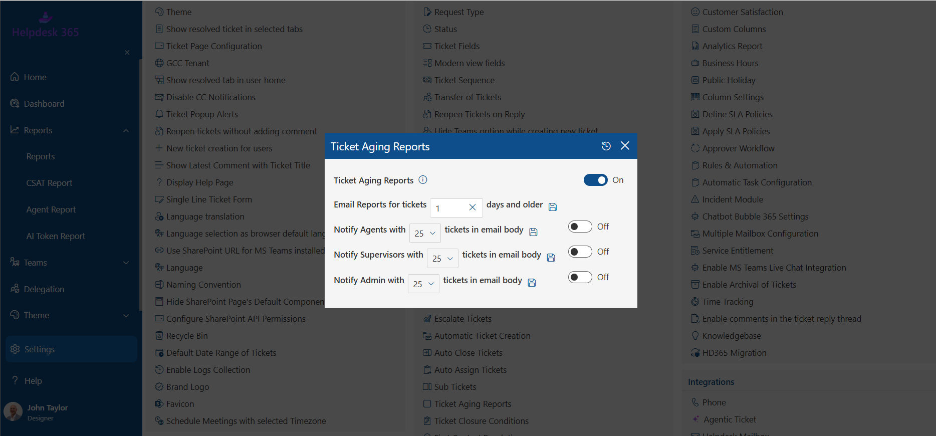
Ticket aging shows how long unresolved requests have remained open.
Use buckets such as under one day, one to three days, four to seven days, and more than seven days. Then identify why older tickets remain open: users, vendors, approvals, parts, specialist teams, or unclear ownership.
4. First Response Time
First response time measures how long users wait before receiving a meaningful initial reply.
Fast acknowledgment builds confidence, but the metric is easy to manipulate with empty responses. Define what counts as meaningful.
5. Resolution Time
Resolution time measures how long it takes to move a ticket from creation to completed resolution.Track average and median. The median is less distorted by unusually old cases, while the average shows overall time burden.
Break results down by priority, category, group, and request type. Comparing password resets with server incidents adds little value.
6. SLA Compliance Rate
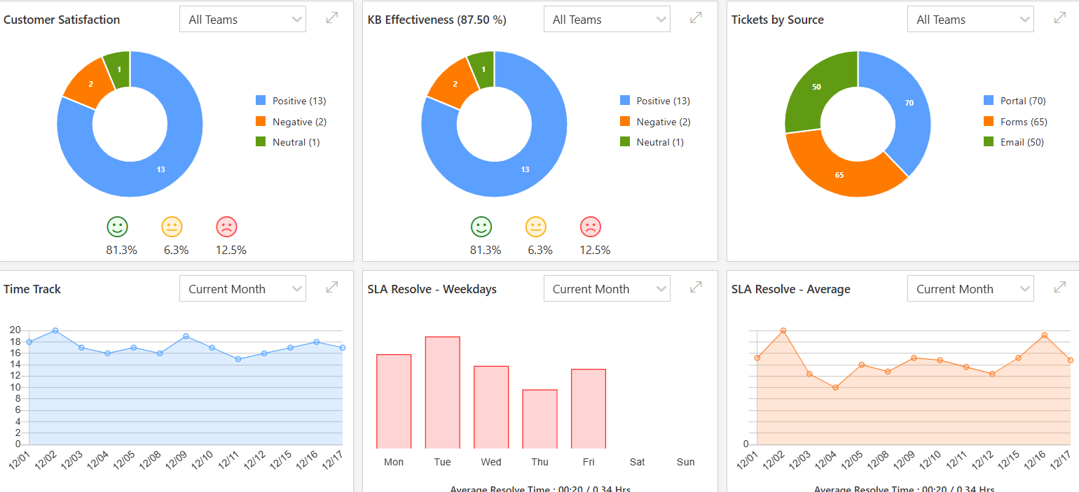
SLA compliance measures the percentage of eligible tickets meeting defined response or resolution targets.SLA compliance rate = tickets meeting SLA targets ÷ eligible tickets × 100.
Show both compliance and upcoming risk. A dashboard that reports only past breaches is useful for review, not prevention.
Repeated failures in one category may reveal poor routing, unrealistic targets, approval delays, or missing expertise rather than weak technician effort.
7. First Contact Resolution
First contact resolution, or FCR, is the percentage of incidents solved during the initial interaction without further support contact.
HDI defines FCR as incidents resolved during the initial contact and recommends reporting performance regularly against quantitative targets and trends.
8. Ticket Reopen Rate
Reopen rate shows how often closed tickets return to an active state.|
A rise can expose rushed closure, incomplete troubleshooting, poor confirmation, weak knowledge, or recurring defects.
Pair it with resolution time. If resolution becomes faster while reopen rates climb, the team may be moving work out of the queue without solving it fully.
9. Tickets by Priority, Category, and Channel
A total tells you how much work exists. Segmentation tells you what kind.
Track priority, service, category, department, channel, location, assigned group, and request type.
This turns reporting into detection. If VPN tickets jump after an update, IT can investigate the root cause instead of repeatedly fixing the same symptom.
10. Technician Workload
Workload views show how tickets are distributed across agents or groups.
Do not use ticket count alone. Ten complex security cases may require more effort than thirty routine access requests.
Review open assignments, priority mix, aging, and SLA risk together. The purpose is fair distribution and healthy flow, not a leaderboard that rewards easy closures.
11. Customer Satisfaction
CSAT captures how users rate support after an interaction.
Show the score with response volume. A 100% CSAT based on four replies is less informative than a slightly lower score from hundreds.
Read comments too. Operational data shows where a problem exists; user feedback often explains why the experience felt poor.
12. Escalation and Self-Service Performance
Track how often tickets move to specialist teams, plus whether users solve common issues through knowledge or virtual support.
High escalation on routine requests may expose routing, permissions, training, or knowledge gaps. For self-service, measure article helpfulness, search success, ticket deflection, and tickets created after knowledge searches.
How Does a Helpdesk Ticket Dashboard Help IT Teams?
A helpdesk ticket dashboard is useful when it changes decisions, not when it only makes reporting look better. When connected with the right helpdesk software, it gives IT teams a clearer view of workload, service risks, and support performance.
It Improves Daily Queue Control
Agents can see assigned work, priority, age, and deadlines without scanning long lists. Managers can find unassigned requests, overloaded groups, and urgent cases.
It Supports Better Staffing
Ticket patterns help managers match coverage to demand.
If Monday mornings consistently bring heavy onboarding volume, move coverage earlier. If night-shift tickets keep breaching targets, the answer may be scheduling rather than asking individual technicians to work faster.
It Reveals Repeat Problems
Category trends can turn twenty similar tickets into one problem-management action.
Instead of repeatedly fixing the same driver, software failure, or access issue, IT can find the cause, update knowledge, automate a fix, or work with the system owner.
It Gives Leaders Evidence
A Head of IT may hear that the helpdesk is overloaded. A dashboard can show whether volume rose, backlog aged, complexity shifted, or SLA risk increased.
Dashboard vs. Report: Which Should You Use?
| Aspect | Helpdesk Dashboard | Helpdesk Report |
|---|---|---|
| Primary Purpose | Supports real-time decisions and daily helpdesk operations. | Supports historical analysis and long-term performance reviews. |
| Key Questions Answered | What is open, at risk, unassigned, delayed, or overloaded right now? | Why did performance change, which patterns repeat, and did improvements work? |
| Data Focus | Current and near-real-time ticket activity. | Historical ticket data, trends, and performance patterns. |
| Best Used For | Daily queue monitoring, workload management, SLA tracking, and identifying urgent issues. | Weekly, monthly, and quarterly reviews, trend analysis, and performance evaluation. |
| Decision Type | Immediate operational decisions. | Strategic and performance-based decisions. |
| Why You Need It | Helps teams respond quickly to problems and manage active workloads. | Helps teams understand recurring issues and improve helpdesk performance over time. |
| Helpdesk 365 Capabilities | Provides dashboards, ticket volume tracking, response tracking, SLA visibility, and performance insights. | Provides SLA reports, trend analysis, performance reporting, and custom reports by department, category, priority, and other areas. |
| Recommended Approach | Use dashboards for daily control and real-time visibility. | Use reports for deeper analysis and regular performance reviews. |
💼If your team still exports ticket data before answering basic service questions, explore how Helpdesk 365 helpdesk software can bring ticket management, reporting, and performance visibility into one working view
How to Choose the Right Helpdesk Dashboard
Choose a helpdesk dashboard by starting with decisions, not features. Identify who will use it, which questions they must answer, which data supports those answers, how quickly information must update, and what action follows each warning. Then test filtering, drill-down, role access, SLA visibility, customization, reporting, and fit with your existing workflow before buying.
Step 1: Define the Audience
List technicians, team leads, IT managers, service owners, and executives. Give each group only the measures required for its decisions.
Step 2: Choose a Core KPI Set
Start with eight to twelve measures covering demand, backlog, speed, SLA performance, quality, workload, and satisfaction.
Add specialist metrics only when they answer a real business question.
Step 3: Test Filtering and Drill-Down
A chart should move from summary to cause.
If SLA compliance drops, can you filter by priority, department, category, and technician, then open the underlying tickets? If not, the dashboard may flag a problem without helping you investigate.
Step 4: Check Alerts and SLA Visibility
Look for active deadlines, aging warnings, breach risk, unassigned tickets, and escalation signals.
Step 5: Validate Data Quality
A polished helpdesk ticket dashboard cannot repair inconsistent categories, vague priorities, missing ownership, or incorrect statuses.
Standardize definitions before trusting comparisons.
Step 6: Test Real Work
Use actual ticket scenarios. Ask whether the dashboard helps your team catch risk earlier, understand workload faster, identify recurring issues, and explain performance without exports.
💼For Microsoft 365 environments, evaluate Helpdesk 365 using real categories, SLA rules, escalation paths, and reporting questions. Judge the dashboard by how quickly your team can move from a warning to the tickets causing it.
Top Recommendation: Helpdesk 365 for Microsoft 365 Teams
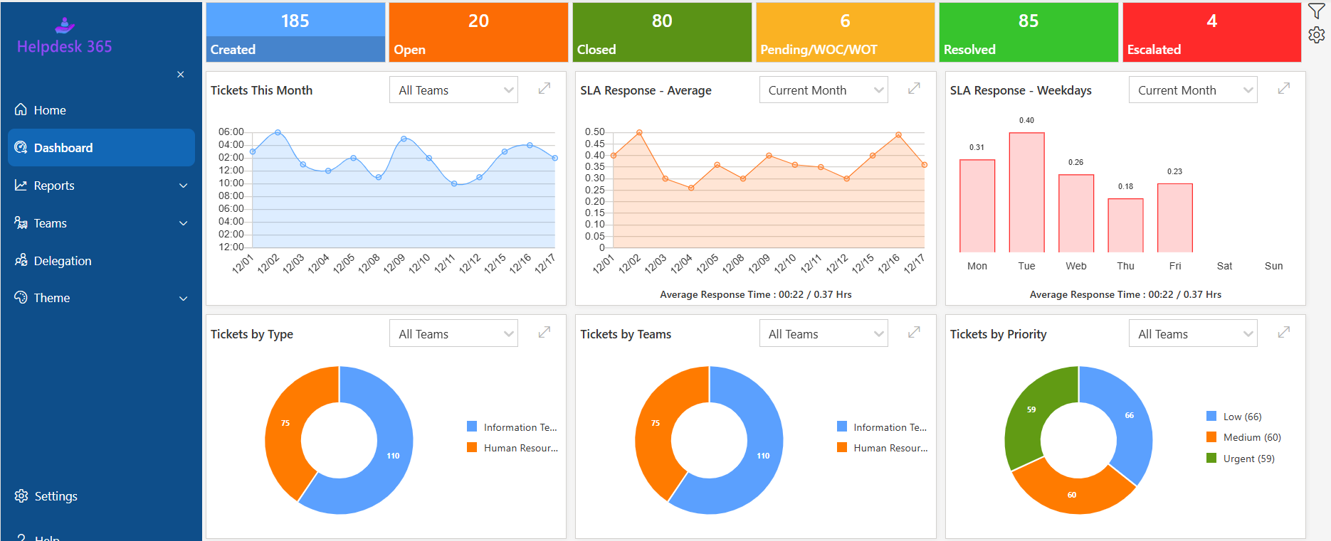
For organizations already using Microsoft 365, Helpdesk 365 is a strong option for managing support tickets and monitoring service performance from one place.
It covers many of the capabilities IT teams should look for in a helpdesk dashboard, including:
- Ticket volume and status tracking
- SLA monitoring and escalation
- Response and resolution reporting
- Ticket aging and backlog visibility
- Technician workload tracking
- Custom fields, forms, and views
- Customer satisfaction surveys
- Knowledge base support
- Power BI reporting
- Microsoft Teams, Outlook, and SharePoint integration
- AI-assisted ticket summaries and support features
Because these features connect reporting with day-to-day ticket management, IT teams can identify issues and act on them without relying on separate reporting tools.
💼See how Helpdesk 365 dashboards, SLA tracking, automation, and reporting fit your Microsoft 365 support workflow.
This version will fit the blog much better and keeps the section commercial without making it feel like a product page.
Conclusion
A helpdesk dashboard should make the state of support easier to understand and harder to ignore every day.
Track demand, completed work, backlog, aging, response time, resolution time, SLA performance, FCR, reopen rate, workload, satisfaction, escalation, and knowledge effectiveness. More importantly, connect each metric to an owner and a decision.
The strongest helpdesk ticket dashboard does not reward activity for activity’s sake. It shows whether users are receiving reliable help, technicians have manageable work, service promises are being kept, and recurring problems are consuming time.
For Microsoft 365-focused organizations, Helpdesk 365 provides dashboards and reporting for ticket volumes, response and resolution performance, SLA tracking, agent productivity, and support trends. Use a demo to test those capabilities against your actual support process.
See How Helpdesk 365 Fits Your Support Workflow ?
Bring real ticket types, SLA targets, escalation rules, and reporting questions when evaluating Helpdesk 365. The right dashboard should help your team see the problem, find the cause, and act before the next user has to chase IT for an answer..
Join Our Creative Community
Frequently Asked Questions
What are the most important helpdesk dashboard metrics?
Start with tickets created and resolved, backlog, aging, first response time, resolution time, SLA compliance, FCR, reopen rate, technician workload, and CSAT. Add category trends, escalation, and self-service measures when useful. The right mix should explain demand, speed, quality, risk, and capacity together.
How many metrics should a helpdesk dashboard show?
There is no universal number, but the primary view should stay focused. Eight to twelve core KPIs is a practical starting point. Move detailed analysis into secondary tabs or reports. If users search through dozens of widgets before finding urgent work, the dashboard has failed.
How often should IT managers review it?
Operational metrics such as unassigned tickets, SLA risk, critical incidents, and workload should be checked during the working day. Backlog movement, category growth, FCR, reopen rate, and CSAT can be reviewed weekly. Leadership trends often fit monthly reviews, with quarterly analysis for staffing and improvement priorities.
What is a good SLA compliance rate?
There is no universal target. The right level depends on criticality, business hours, staffing, contracts, and priority definitions. Set realistic targets, segment results by service and priority, and improve from your baseline. A high overall rate can still hide repeated breaches on critical tickets.
How is a dashboard different from a ticket queue?
A queue is a working list of requests. A dashboard summarizes what the queue means. The queue tells an agent which ticket to open next. The dashboard tells a manager whether demand is rising, deadlines are at risk, workloads are uneven, or old tickets are accumulating.


_JiluXJRGNl.svg)